Leapros Workforce Solutions
Brief
Leapros Workforce Solutions is a staffing and recruitment firm that excels in placing candidates in administrative, financial, technology, engineering, and healthcare roles. They collaborate with businesses to understand their unique workforce needs and create tailored solutions, including contract staffing, direct placement, and executive search services. For job seekers, Leapros offers comprehensive career support, such as resume writing, interview preparation, and job search guidance. Founded to provide high-quality workforce solutions, Leapros is dedicated to helping businesses achieve success and assisting job seekers in finding fulfilling careers.
colors
Primary
About
🡦 Year Founded: 2014
🡦 Location of Headquarters: Saint Charles, Illinois
🡦 Industry Focus: Talent acquisition and workforce placement
Tools
Illustrator / Photoshop / InDesign / InVision / Zeplin
fonts
Monteserrat / Open Sans
Fresh Mint • #72BE8F
Soft Stone • #E3E3DE
Sage Mist • #C8D8A0
Spring Moss • #AACF81
Midnight Tide • #001E27
Deep Harbor • #064852
Ocean Teal • #0B8074




A Modern Identity,
Built Together.
For Leapros Workforce Solutions, the rebranding process focused on modernizing a long-established staffing brand while preserving the elements that clients already recognized. The original illustrated frog mascot was simplified into a clean, modern frog-hand icon, creating a more versatile and contemporary identity without losing the brand's personality.
From the earliest mood boards to the final brand rollout, the project encompassed a complete visual identity system. Every design decision was shaped through close collaboration with the client, incorporating their preference for fluid, wave-inspired motion and a clean visual style while maintaining the recognizable green color palette associated with the original brand.
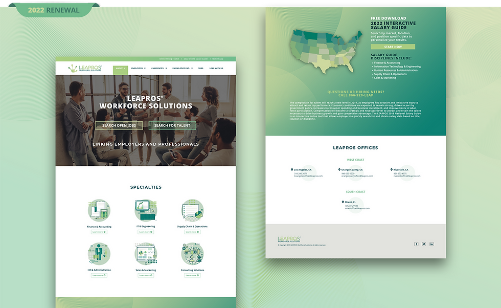
The refreshed identity was carried across a comprehensive range of brand touchpoints, including the brand guidelines, business stationery, brochures, marketing collateral, website, email communications, and social media assets, creating a consistent and cohesive brand experience across both print and digital platforms.
🡦 CLIENT-DRIVEN BRAND EVOLUTION
The original illustrated frog mascot was refined into a simplified frog-hand icon, preserving the brand's character while introducing a cleaner, more contemporary identity.
🡦 COMPLETE BRAND ECOSYSTEM
A cohesive set of icons was designed to guide clients and users through Agility’s offerings, simplifying navigation and enhancing user interaction.
🡦 CONSISTENT VISUAL EXPERIENCE
A cohesive design language was established across every customer touchpoint, balancing the client's vision with a modern, flexible brand system.