
Minority Corporate
Counsel Association
Brief
The Minority Corporate Counsel Association (MCCA) is a non-profit organization that aims to advance the hiring, retention, and promotion of diverse lawyers in corporate law departments and the law firms that serve them. The MCCA was founded in 1997 and is headquartered in Washington, D.C. The organization provides resources and networking opportunities for minority lawyers and works with corporations and law firms to promote diversity and inclusion in the legal profession. The MCCA also conducts research, provides training and education, and recognizes organizations and individuals for promoting diversity and inclusion in the legal industry.
colors
Primary
About
🡦 Year Founded: 1997
🡦 Location of Headquarters: Washington, District of Columbia
🡦 Industry Focus: Corporate law and legal diversity
Tools
After Effects / Illustrator / Photoshop / InDesign / InVision / Zeplin
fonts
Abhaya Libre / Lato
MCCA Yellow • #E7B14C
MCCA Steel Blue • #82A3BB
MCCA Purple • #65266C
MCCA Orange • #D56431
MCCA Blue • #359DD8
MCCA Red • #DF554C
MCCA Navy • #253E5D
MCCA Green • #639640


Timeless Foundation for
a Legacy Brand.
MCCA’s rebrand established a classic, credible identity for the legal field—designed to feel trustworthy, refined, and enduring.. A unified visual system provided both structure and meaning, ensuring the brand communicated with clarity and consistency.
Every element—from typography to color to layout—was crafted to align with MCCA’s goals and legacy.
🡦 FULL BRANDING PACKAGE
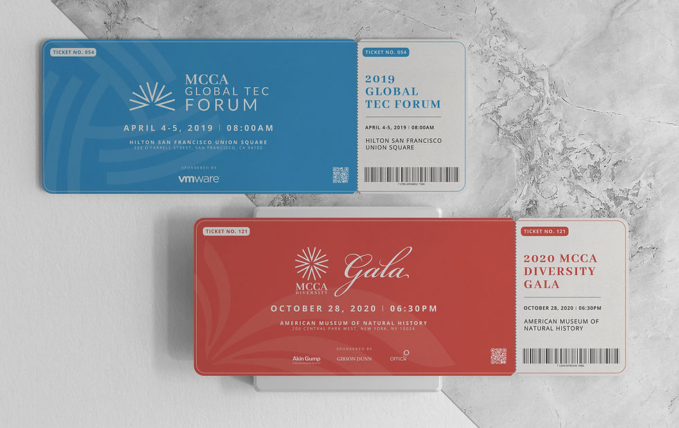
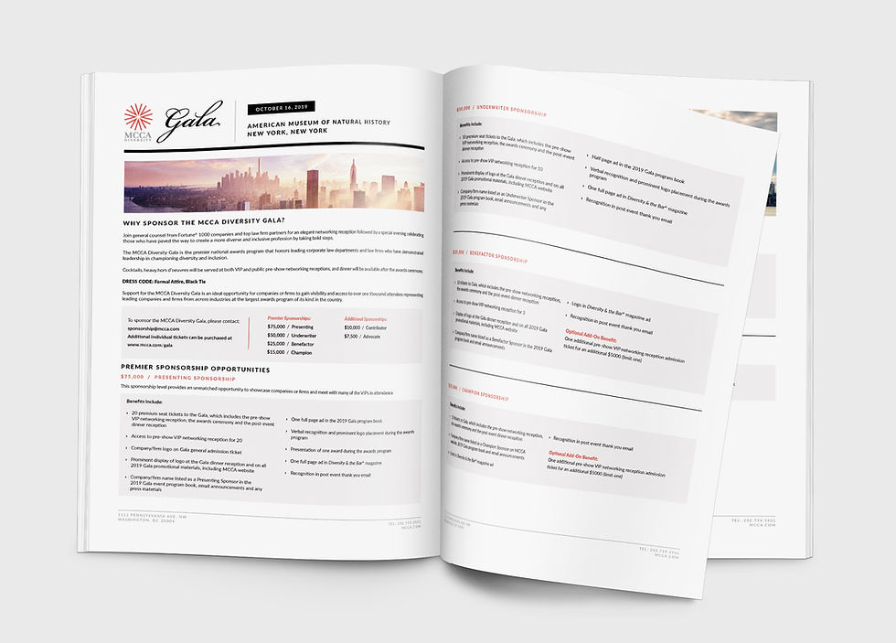
Developed a complete visual identity system—logo, typography, templates, and layouts—delivering consistency across all brand assets.
🡦 COLOR AS A VISUAL FRAMEWORK
Applied color with the intention to establish hierarchy and reinforce meaning.
-
Awards materials reflected honor and recognition
-
Core hues reinforced professionalism, integrity, and tradition
-
Distinct palettes distinguished sub-brands while keeping the system unified
More than decoration, color became a tool for clarity and purpose across the mission.
🡦 CLEAR, CONSISTENT TOOLS
Equipped teams with guidelines and templates to ensure seamless application across digital, print, and presentation channels.





Bringing Identity to Life.
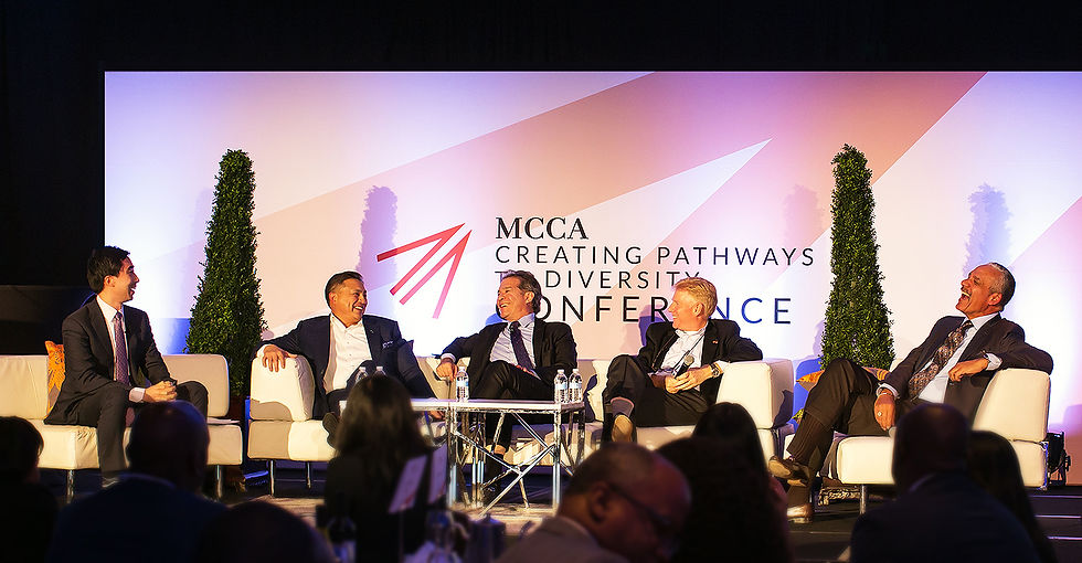
For MCCA, motion was used strategically to unify and amplify its brand across platforms. A custom logo animation served as a visual signature, created to support high-profile events and extend seamlessly into digital applications.
By blending design precision with motion storytelling, the animation became more than a visual— it functioned as a recognizable brand cue. This approach helped build familiarity and elevate the organization’s presence at key moments, both online and in person.
🡦 Website Banner Animations
A series of vibrant banners designed to grab attention and highlight Agility’s innovative solutions. These animations were updated seasonally, offering fresh visuals throughout the year while maintaining consistency with the brand’s energy.


